A Closer Look at Bitmap Filters within the SAi FlexiPRINT RTUV 22 Software (Part 7)

flexiprint bitmap filters
Next up on our Bitmap list of options to look at is the Filters feature that ships with FlexiPRINT.
The cool thing about having these Bitmap Filters build in to the program, is that you are able to make Raster adjustments without going to another 3rd party software.
This video is part of a Mini-Series.
Next video covers Adobe Filters.
Previous video covered Color Mode.
Video Transcript
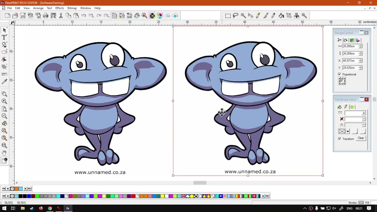
Alright, guys, In today's video, we're gonna be looking at some wet map philtres found in flexi print. But before that, let's have a quick intro first. So today's video can be found on softwaretraining.co.za. co dot Z A. We make sure we need to watch problem solving videos and we also have daily updates. Now, if we're into the programme here, So as you guys can remember or might know, we are busy with a bitmap mini. So if you caught on a bit late, you can always go to the index and follow along. So now what we're gonna do, I'm gonna just make a little, uh, duplicate of this little gremlin I drew a while ago or Grammy. I'm not sure what you call it, and just so we can see the difference between the philtres. So then, uh, this is a bit map like I mentioned, or a raster image, which means these bit map features will work. If I go to Philtres and we do not have a raster selected by the vector, then all those philtres won't be available. But now So let's quickly zoom in. I'm gonna go to our main menu. Go bit map and then I'm gonna take it from the bottom. You can see we've got those philtres and we get to the right. You can see we've got a list of them. So let's just run through a fuse. You get an idea of how it works and then, um yeah, so then this noise philtre this is ideal. If you have, like, photography and stuff like that and it's a lot of artefacts in it, then you can always use this noise philtre and adjust the settings. But in this little image, it's not gonna do much because it's so clean already. Then we've got blur. So if you wanted to actually blur up the image, then you'll see we get this little preview box. You can, um, adjust this to where yeah you want and how big. And we get a nice idea of what it's gonna look like at the moment. We don't see much of a change, but if I had to set these values here on the right, you will see if that will change. Now we've got percent and we've got radius, so I'm just gonna increase the radius so we can start seeing how that image starts blurring as you can see there, then you can adjust the percentage. So if you want more of a lighter blur just a like a slight, slight blur, or then the full blur. Then you have this preview, which is on by default. If it's not, you can just check it. Then you can see a live preview over there. And then we have our classic X and right mark, obviously, X if you wanna cancel it, right, Mark, if you wanna apply, you wanting to know if I apply to check the black background and then, um, it will actually not apply the black background. So just so you know, it's just for previous sake. I think it has it. I was just gonna undo that, then. The next one we have on our list here is a sharpen. So this will obviously do the opposite. So if, uh image is maybe a bit murky and slightly blurred, then you can always use this and try save some, Uh, how can I say quality or bring some sharpness back? And under that, we've got levels. This is almost in many ways similar to the brightness and contrast. But with the levels we, um we can actually decide even where's the black balance and all of that or the the Black point and the white It's a little bit confusing at first, but, um, if you play with it a bit, it was not making sense. So on the left here, we've got the black, and then we can actually use this little slider and start moving it in, and you can see as we do, we will increase the black level on the right for the white. So as we pull this in, we can start increasing the white level. And it kind of does also like a form of contrasting. Now, you can always find a balance where you can start moving things out and get a nice little clean look. So if you wanted to improve it a bit now, at the bottom here, you can see the value as well. So if you have to repeat it on another image, you can just look, what did you set your last one to? And then we have auto. Where will try auto, do it and then the reset. So I'm gonna cancel that one. And then let's go again to effect. Yeah, my apologies bit map, and we go to the bottom philtres, and then we've got colour balance. Colour balance is handy If, um, do you wanna enhance certain colours inside your design? Now you'll see, uh, from the get go, it's normally set on mid turns. Now we can set the highlights mid turns and shadows. So let's say you do a test print and realises Okay, maybe your mid turns is something wrong. And then on the left here, you can see we've got the cyan, magenta and yellow and the right. They've got R GB for the red, green and blue. So now you can use this to kind of adjust what's missing. So maybe it's a little bit green. Then we can always take the green slider and pull it down a bit, or vice versa. If it's not, uh, green enough, or if there's too much yellow, you can kind of draw some blue or too much blue. Draw some yellow. Now, this you can do with all three of these settings so you don't have to just adjust mitres. You can do all of them or just one if you want likewise at the bottom here, you can see we've adjusted the yellow. So there we've got a 3% on the yellow. So once again, if you wanna duplicate this, just write these values down under which category, then you can always do that on another image. Very handy if you want to. Colour correct. So then we've got once again bitmap, um Philtres. And then we want to go here to the next one, which is brightness and contrast. And I'm sure most of you will be kind of familiar with this. But the nice thing about this one is it actually comes with saturation as well. You can see we've got the brightness contrast and then at the bottom here, we've got saturation. So now this is nice. Let's say you, uh, the print your, uh, do a test print and you realise your colours are a bit washed out and you can simply go. Yeah. Oops. Let me try. Get that little handle and then you'll slowly start increasing this till you find OK, There's maybe more colour. So I'm just gonna adjust my contrast slightly and boost up my brightness a little bit. Just so we get something a little bit more striking Wow, saturation A little bit more. Say OK. And like I said, this is a great way to quickly boost and enhance some colour if you find yourself a bit flat in the final print. But yeah, otherwise that is it on the philtre. So just a quick recap. Yeah, you obviously need a rest or bit map selected, won't work with a vector. Then you wanna go to your main menu bit map and second to the bottom philtres. And then there's a list of them. They will do different things depending on your needs and yeah, otherwise, in the meanwhile, if we head here to softwaretraining.co.za. co dot Z A, you guys will notice we've got a variety of different Softwares we do cover, and you can also isolate your search on the top or right. If you do not, however, find the training videos you're looking for, just simply go, Yeah, request a training video, fill in the mini form, and then we'll do our basic try and make that for you. But otherwise thanks guys for watching and cheers