Some Industry Standard Design Elements Within the AM.CO.ZA InkRIP Software (Part 4)


inkrip standard design elements
When it comes to industry standard design elements, there are many different elements depending on your application type.
From these different elements we will be focusing on the key ones that will be used within the Large Format Printing (LFP) industry.
This video is part of a Mini-Series.
The next video covers Size & DPI.
The previous video covered Programs.
Video Transcript
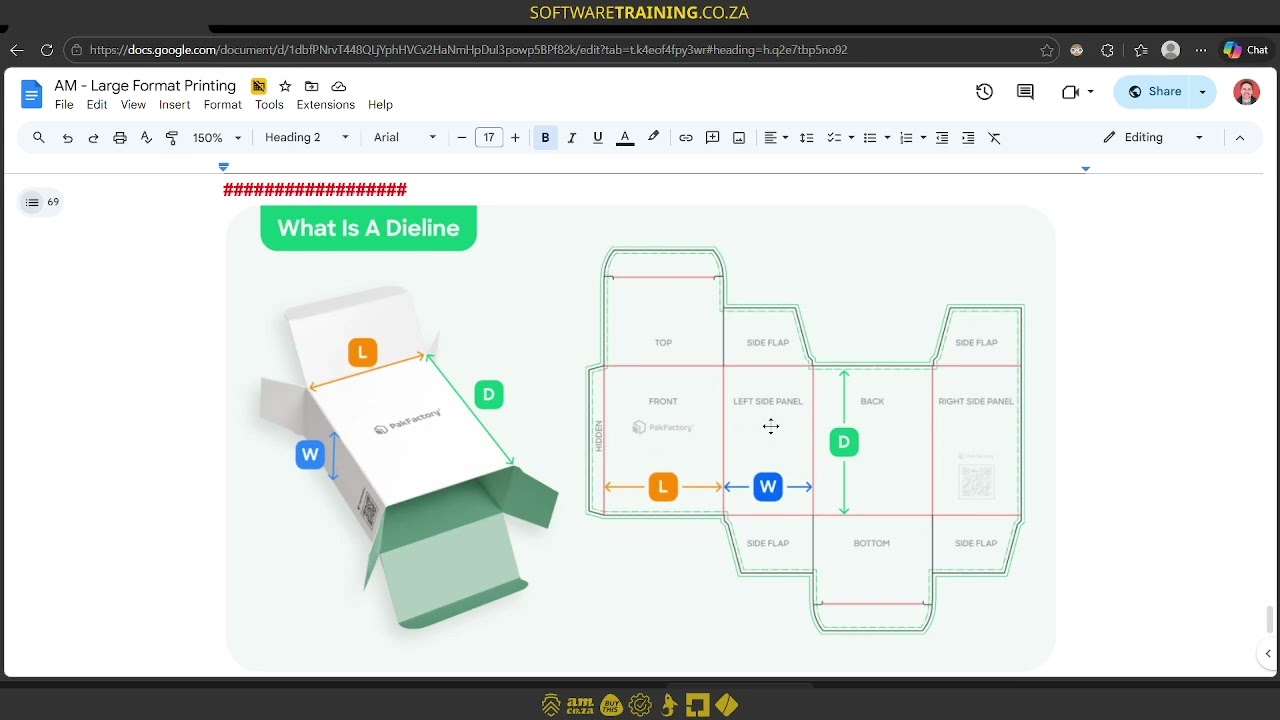
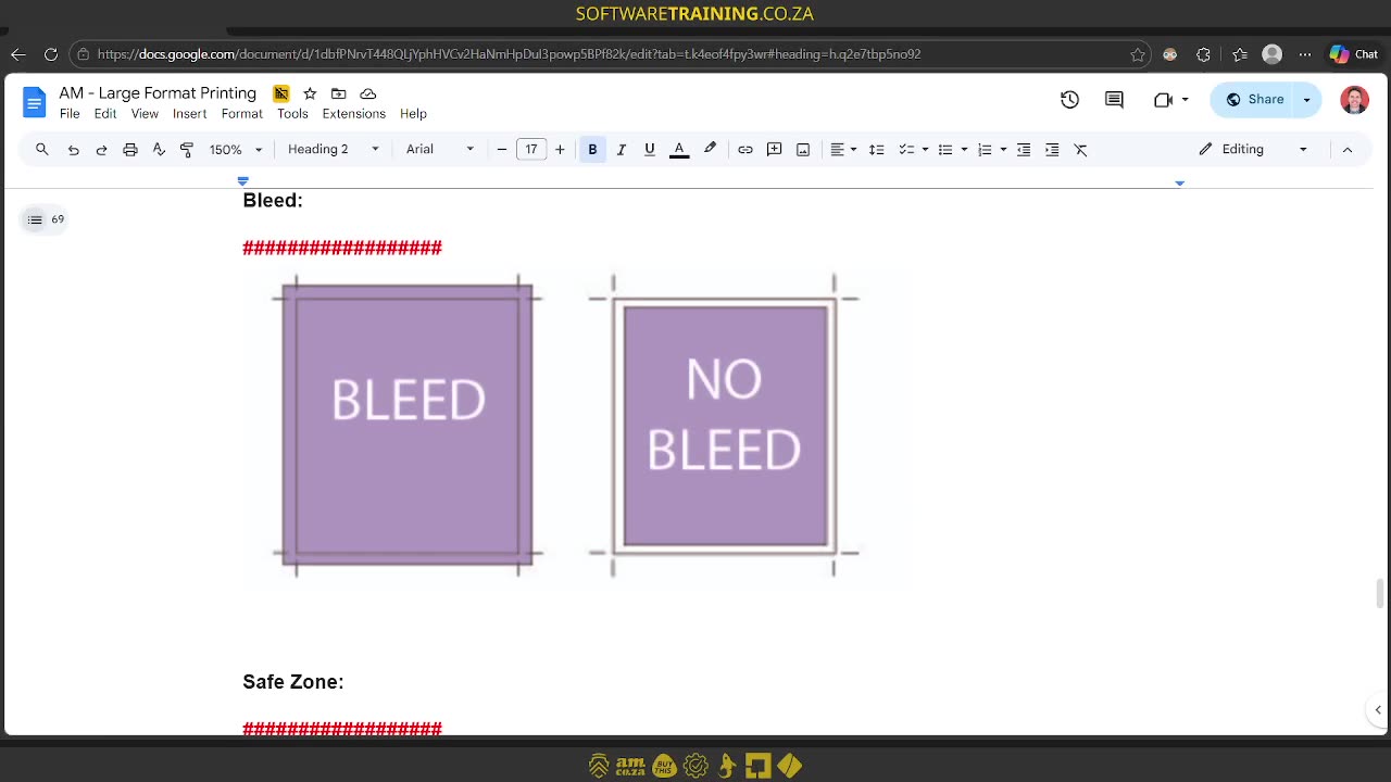
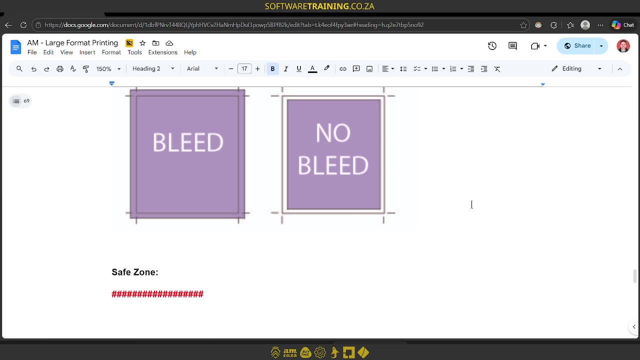
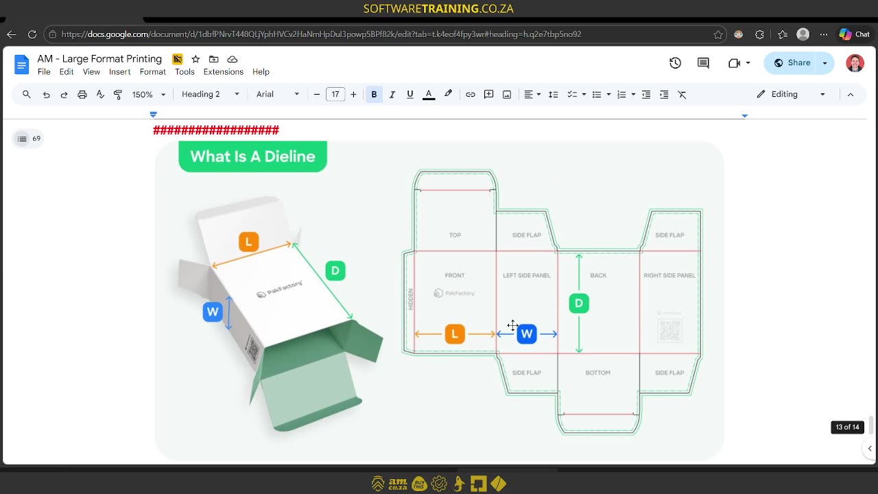
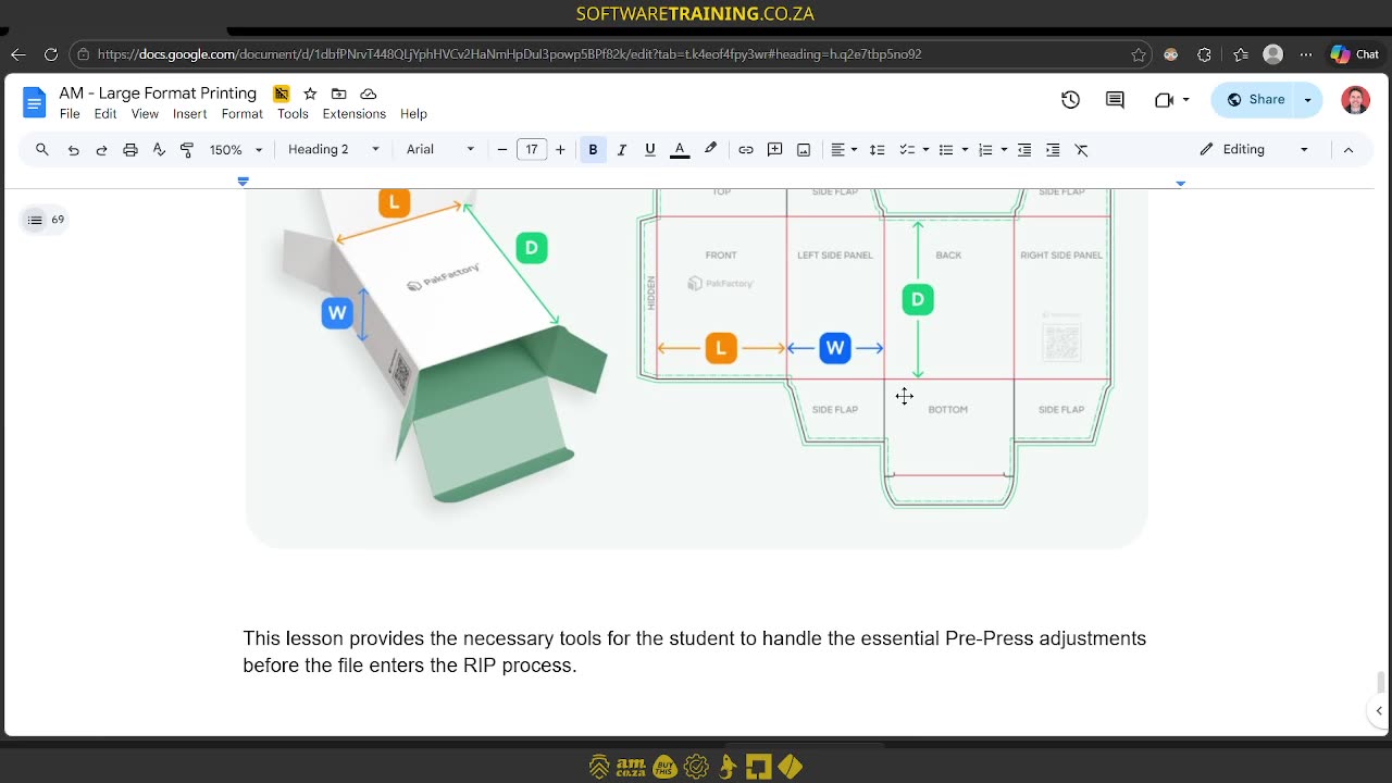
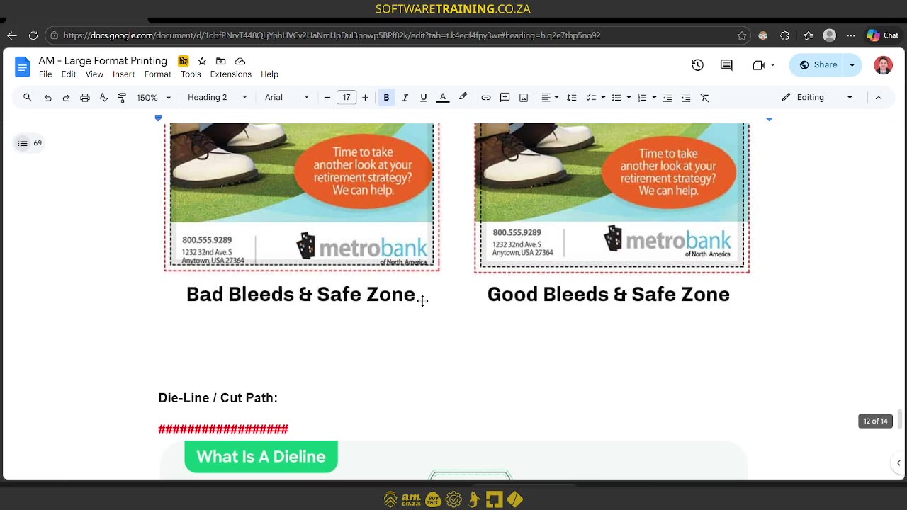
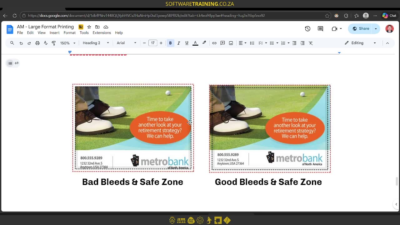
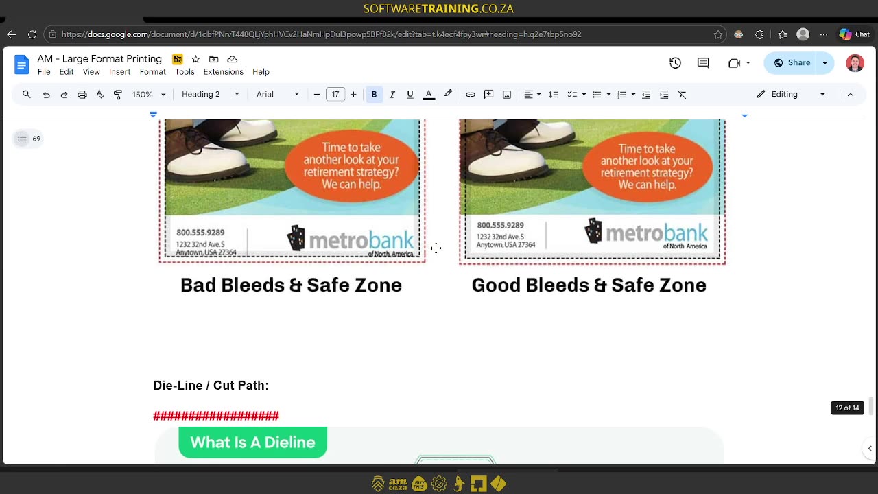
Howdy, guys. OK. In today's video, we're gonna be looking at some good design elements when we're using incrypt. But before that, let's have a quick intro first. So, today's video can be found on softwaretraining.co.za. We make short and easy to watch problem-solving videos, and we also have daily updates. Now, when it comes to the design elements, there's a few things we wanna cover. The first one is gonna be bleed. We wanna look at that cause all these elements are gonna help you with your final design to make it more clean and accurate. Then, after that, we're gonna go over to safe zones. We're gonna be looking at some dye lines, cut paths, or registration marks, and then also outlining text. So now, if we start you with a bleed and um no bleeds, what it comes down to is when we're making a design, we wanna make sure our actual design spills a bit past our measurement. So, let's say our measurement is 10 centimetre by 10 centimetre, at least what the client wants. Then, we wanna make sure we have a little bit that extrudes past that. And then, um, otherwise, what will happen is if you cut a 10 by 10, you're gonna have a white border which is gonna be obvious in the final one. So, you're gonna have to be very, very accurate. So, what people like to do is they take the actual design and they bleed it a little bit past the edges and then it gives you a way cleaner final product. Now, a good practise is about 10 millimetres. So then, um. Yeah, you don't have to have too much extra of your design over the edges, but that is a good practise. Then, another thing to keep in mind here is our safe zone. Now, this is an example with the bleed and a safe zone, but what a safe zone comes down to is, let's say we make a design, we have some text on it and some important graphics. Then, what we wanna do is make sure we don't add anything important too close to that edge that we're gonna be cutting because maybe it's slightly off and you're cutting parts of your text down. So, as you can see here on the right, the spacing's a bit better here, so you can easily read what's happening and With our bleed over here, even if we cut a little bit out, we're still gonna have our information or our key information, nice and safe within the design. So, the general practise is you want about 25 to 50 millimetres. You wanna keep your text and import information away from the sites. Then, another thing we've got here is the die lines and cut lines. Also, um, Often, this is combined with registration marks. So what that comes down to is let's say you're doing a box design, like you can see here in the sample, then you might have some prints on this, and then you also wanna have a line where your design is gonna be cutting out on, so that afterwards, you can fold it. So, let's say you're using one of uh like a print plus a vinyl cutter or you're just using a vinyl cutter afterwards with the registration marks. Then it's gonna be important to have, or it's gonna be important to have your actual cutting lines. So, some vinyl cutters, they can make little um folding lines as well. So, it's got a different, uh, how can I say, blade tip, and it will put little jagged edges and then you can actually fold your design or your box more easily. So, that is what it is, dye lines or also um cut lines. Then, another thing that we wanna be looking at, OK, we don't have it here, and that's gonna be converting your text. So, it is very important that if you've got, let's say, um fonts that you're using in your design, so let's say something like this is Metro Bank. Then you send this design file to your actual, or let's say the client sends it to you. Let's say you're the one actually doing the final designs. If you don't copy the text along, then this is gonna go default or default to some form of um generic that you have in your PC. So, if you don't have the font, this is gonna replace it to some generic, then your design is gonna be looking different to what the original was. So, a good practise is the designer should take those design files, select the text, and convert them to a form of path or like a form of outline. So, that, what that will do is it will basically remove any text abilities, so you won't be able to edit it anymore, but it will stay the same no matter what programme you open it in, because it will turn into a form of graphic. But yeah, otherwise, that is it on the elements of design, some important ones there. That um you're gonna be working with, so just a quick recap, so it is our outlining text, and then we've got our guidelines, which is um for products and packaging mostly. Then we have our safe zone and then we have our bleed. But yeah, otherwise, if we head here to softwaretraining.co.za. za, you guys will notice we've got a variety of different softwares we do cover, and you can also isolate your search on the top right. If you do not, however, find the training videos you're looking for, just simply go here on the left, request a training video, fill in the meeting form, and then we'll do our best to try and make that for you. But otherwise, thanks guys for watching and cheers.